Style Guide
Overview
Below there are 3 sections of modules/components
- Modules: This is content on mirion.com that is only page level - this content is built onto each page manually.
- Components: This is content on mirion.com where the same element can be referenced on multiple pages - these modules are great for callouts/content that will be the same on multiple pages so that if a change or edit comes, it only needs to be made once instead of on every page.
- Reference Modules: These are modules that are only used to reference other elements on the site
On each module, I made sure to include the type of text editor so it can be clear what level of customization is available for the content.
- Simple Text: No access to src code, just a simple text editor. The most customization available in these fields is: Bolding, Italicizing, and Linking
- Rich Text: Access to src code where customization is much more accessible
- Hybrid Text: Has access to src code, but does not have all the capabilities of a Rich Text field
There are also 2 fields that are in the Settings on most modules:
- Background Color: White (default), Light Gray (most used), Blue (least used)
- Section ID: Used for anchoring
Modules - content/blocks that are only page level
Rich Text Module
This is the Rich Text/WYSIWYG (What You See Is What You Get) editor for the site
Below are examples of the styling for titles, buttons, etc
Heading 2
Heading 3
Heading 4
Heading 5
Heading 6
This is a note
Split Content
Fields:
- Heading
- Left/Right Image
- Left/Right Image CTA: Links image
- Left/Right Video
- Left/Right Content: Rich Text WYSIWYG
- Left/Right CTA
- Use small font size toggle
- Left Content Width: 25%, 50%, 75%
- Alignment: Top, Center
- Background color selector
- Section ID
Test Heading

Lorem ipsum dolor sit amet, consectetur adipiscing elit, sed do eiusmod tempor incididunt ut labore et dolore magna aliqua. Ut enim ad minim veniam, quis nostrud exercitation ullamco laboris nisi ut aliquip ex ea commodo consequat.

Lorem ipsum dolor sit amet, consectetur adipiscing elit, sed do eiusmod tempor incididunt ut labore et dolore magna aliqua. Ut enim ad minim veniam, quis nostrud exercitation ullamco laboris nisi ut aliquip ex ea commodo consequat.
Media
Fields:
- Heading
- Image
- Video
- Layout: Contained vs Full Bleed
- CTA
- Brand: Adds the bar of color to the left of the image
- Background Color
- Section ID
- Parallax Effect Toggle
- First on Mobile Toggle

Media - Full Bleed with Brand

Media - Full Bleed Parallax
Media - Video
Text Callout
Fields:
- Heading
- Content: Simple Text
- CTA
- Background Color Selector
- Max Width: Used for centering content
- Font Weight: Bold/Normal
- Section ID
Test Header
Lorem ipsum dolor sit amet, consectetur adipiscing elit, sed do eiusmod tempor incididunt ut labore et dolore magna aliqua. Ut enim ad minim veniam, quis nostrud exercitation ullamco laboris nisi ut aliquip ex ea commodo consequat.
Background Callout
Fields:
- Heading
- Content: Simple Text
- CTA
- Secondary CTA
- Background Image
- Mobile Background Image
- Background Color
- Text Color
- CTA Color: White, Blue, Black
- Secondary CTA Color: White, Blue, Black
- CTA Style: Outline/Solid
- Secondary CTA Style: Outline/Solid
- Overlay Opacity
- Content Position: Left/Right
- Content Width: 25%, 50%, 75%, 100%
- Parallax Effect Toggle
- Section ID

Example Heading
Lorem ipsum dolor sit amet, consectetur adipiscing elit, sed do eiusmod tempor incididunt ut labore et dolore magna aliqua. Ut enim ad minim veniam, quis nostrud exercitation ullamco laboris nisi ut aliquip ex ea commodo consequat.
Form
Fields:
- Heading
- Content: Rich Text
- Form Selector*
- Background Color Selector
- Section ID
Example Title
Lorem ipsum dolor sit amet, consectetur adipiscing elit, sed do eiusmod tempor incididunt ut labore et dolore magna aliqua. Ut enim ad minim veniam, quis nostrud exercitation ullamco laboris nisi ut aliquip ex ea commodo consequat.
Search
Fields:
- Heading
- Short Description: Simple Text
- Search Config*: Global, Resources, Events, Trainings, Webinars, Careers and News
- Section ID
Example Heading
Lorem ipsum dolor sit amet, consectetur adipiscing elit, sed do eiusmod tempor incididunt ut labore et dolore magna aliqua.
CTA Card
Fields:
- Heading
- CTA
- Pull From Global Content Toggle
- Brand
- Section ID
Test Heading
Quick Links
Fields:
- Heading
- Icon Image Selector
- Link Configuration
- Section ID
- Alignment: Left, Center, Right
Test Heading
Blocks Layout
This was really only used on the old homepage but can be adapted to be used in other places.
Fields:
- Top/Bottom Brand
- Top/Bottom BG Image: the module will naturally pull the brand's color and pattern to create the background on the tile, but this gives the option to override with another image
- Top/Bottom Heading
- Top/Bottom Subtitle
- Top/Bottom CTA
- Top/Bottom Alignment: Left/Right
- Background Slide*: pulls from the pre-defined components
- Layout*: Blocks-Left Image-Right/Image-Left Blocks-Right, Image-Only Contained
- Section ID

Improving quality of cancer care from diagnosis through treatment

Powering advancements in nuclear energy with radiation safety innovation


Impact Stories
Any variety of background colors can be used when using the Impact Stories module
Note: There are max 4 spots in this section
Fields:
- Title
- Description: Simple Text
- Tile Colors*: Navy White, Navy Gold, Electric Blue, Gray Navy
- Tile Statistic*
- Tile Description*
- Tile Link
- Tile Image
- Link Style: Button/Text Link
- Hide/Show Carat
- Section ID
Impact Stories
Lorem ipsum dolor sit amet, consectetur adipiscing elit. Aenean eu nulla diam. Donec et placerat tellus. Pellentesque habitant morbi tristique senectus et netus et malesuada fames ac turpis egestas.

99%
Lorem ipsum dolor sit amet

50 More
Lorem ipsum dolor sit amet

Under 10
Lorem ipsum dolor sit amet

300+
Lorem ipsum dolor sit amet
Impact Banner - Statistic
Fields:
- Impact Type: Statistic
- Position: Left/Right
Defines which side the statistic shows up on - can define the sentence structure for the banner - Impact Text: Hybrid Text - allows for src code access, but should not be used for this Impact Type
- Impact Statistic: Where we define the emphasized statistic
- Statistic Color: Brand Colors
- Background Color
- Section ID
Impact Statements
Can use any variety of colors as the background for the tile.
Cards will stretch if the stats/content do not match up well
Fields:
- Title
- Description: Simple Text
- Tile Colors: Navy White, Navy Gold, Electric Blue, Gray Navy
- Tile Content: To create the statistic - we use a span and class to identify the statistic styling
- Background Color
- Section ID
Impact Statements
Over 10%
Lorem ipsum dolor sit amet, consectetur adipiscing elit.
150+
Lorem ipsum dolor sit amet
New Feature
Lorem ipsum dolor sit amet
1800
Lorem ipsum dolor sit amet
Text and Boxes
Fields:
- Heading
- Description: Hybrid Text
- Button
- Alignment: Top/Center (for the Heading & Desc Content)
- Move Text to Right/Left
- Box Title
- Box Description: Hybrid Text
Example page: The Vital Platform
Lorem ispum dolor sit
Lorem ipsum dolor sit amet, consectetur adipiscing elit. Morbi hendrerit, mi ut dapibus commodo, ipsum leo auctor leo, vitae dictum tellus risus sit amet mi. Lorem ipsum dolor sit amet, consectetur adipiscing elit. Morbi hendrerit, mi ut dapibus commodo, ipsum leo auctor leo, vitae dictum tellus risus sit amet mi.
Box Title 1
Lorem ipsum dolor sit amet, consectetur adipiscing elit. Morbi hendrerit, mi ut dapibus commodo, ipsum leo auctor leo, vitae dictum tellus risus sit amet mi.
- Item 1
- Item 2
Box Title 2
Lorem ipsum dolor sit amet, consectetur adipiscing elit. Morbi hendrerit, mi ut dapibus commodo, ipsum leo auctor leo, vitae dictum tellus risus sit amet mi.
- Item 1
- Item 2
Box Title 3
Lorem ipsum dolor sit amet, consectetur adipiscing elit. Morbi hendrerit, mi ut dapibus commodo, ipsum leo auctor leo, vitae dictum tellus risus sit amet mi.
- Item 1
- Item 2
Box Title 4
Lorem ipsum dolor sit amet, consectetur adipiscing elit. Morbi hendrerit, mi ut dapibus commodo, ipsum leo auctor leo, vitae dictum tellus risus sit amet mi.
- Item 1
- Item 2
Media Overlay
This was built for the Vital platform and has different customization options
Below I provided two options where the content was either Top Spot focused and Bottom Spot focused
Fields:
- Top Background Image*
- Top Logo
- Top Content: Rich Text
- Top Button
- Top Secondary Button
- Bottom Background Image*
- Bottom Logo
- Bottom Content: Rich Text
- Bottom Button
- Bottom Secondary Button
- Overlay Image/Video
- Inline Video Toggle: This is to make a video autoplay - this should only be used when the video is completely silent
Example Page: The Vital Platform
Logo/Content in Top Spot:
Logo/Content in Bottom Spot:
Three Column Content
Fields:
- Heading
- Heading Alignment: Left/Center
- Column Image*
- Column Heading*
- Column Description
- Column Link: Adding a CTA will also turn the image into a link
Test Heading

Test 1
Lorem ipsum dolor sit amet, consectetur adipiscing elit. Aenean eu nulla diam.

Test 2
Lorem ipsum dolor sit amet, consectetur adipiscing elit. Aenean eu nulla diam.

Test 3
Lorem ipsum dolor sit amet, consectetur adipiscing elit. Aenean eu nulla diam.
Components - content/blocks that can be placed on multiple pages
Accordions
Accordion Module Fields:
- Heading
- Accordion Panel Selection*
- Brand
- Background Color
- Section ID
Accordion Panel Fields:
- Heading
- Display Heading
- Content - WYSIWYG Rich Text
- Resources Selector
- Link List
Accordion - Unbranded
Accordion - Branded
FAQs
Note - the setup of this module/component is exactly the same as Accordions, the difference is that FAQs are configured for AI crawlability purposes.
Fields:
The same as Accordions except for the ability to Collapse/Expand all FAQs
FAQ - Expanded
Background Slides
Background Slides Module Fields:
- Background Slide Selector*
- Section ID
- Parallax Effect
Background Slides Fields:
- Heading*
- CTA
- Slide Image*


Border Cards
Border Card Module Fields:
- Heading
- Content: Rich Text
- Border Card Selection
- Background Color
- Section ID
Border Card Fields:
- Brand
- Show/Hide Brand Logo
- Show/Hide Brand Tag
- Heading
- Display Heading
- Content: Rich Text
- Link List
Example page with all 4 medical brands: Medical About Page.
Border Cards
Border Cards - Logo
Lorem ipsum dolor sit amet, consectetur adipiscing elit. Aenean eu nulla diam. Donec et placerat tellus.
Mirion Medical
Medical Border Card - Brand Tag
Lorem ipsum dolor sit amet, consectetur adipiscing elit. Aenean eu nulla diam. Donec et placerat tellus. Pellentesque habitant morbi tristique senectus et netus et malesuada fames ac turpis egestas.
Content Slides
Content Slide Module Fields:
- Content Slide Selector
- Section ID
Content Slide Fields:
- Brand
- Show/Hide Brand Tag
- Slide Image
- Heading
- Content: Rich Text
- Slide CTA

Mirion Technologies
Content Slides
Content Slides can be used as a standalone callout or can be a slider with multiple CTAs
Page Cards
Note: there is a max of 4 cards for this module
Page Card Module Fields:
- Heading
- Content: Rich Text
- Page Card Selector
- Background Color
- Section ID
Page Card Fields:
- Title
- Link
- Text
- Background Image
There are 3 options for how to set up page cards
- Image + Link + Text
- Image + Text
- Image
Example Title
Lorem ipsum dolor sit amet, consectetur adipiscing elit. Aenean eu nulla diam. Donec et placerat tellus. Pellentesque habitant morbi tristique senectus et netus et malesuada fames ac turpis egestas.
Team Members
Team Member Module Fields:
- Heading
- Team Member Selector*
- CTA
- Background Color
- Section ID
Team Member Fields:
- Headshot
- First Name*
- Last Name*
- Job Title
- Bio


Reference Modules - Page-level modules that only reference entries
Related Content - Image Style


Related Content - Title Style
Related Content - Category Style


Related Content - No Image Style
Featured Slides
Note: This module pulls directly from the product section of the website. We can't place anything other than products in this module
Fields:
- Featured Slides Selector*
- Background Color
- Section ID
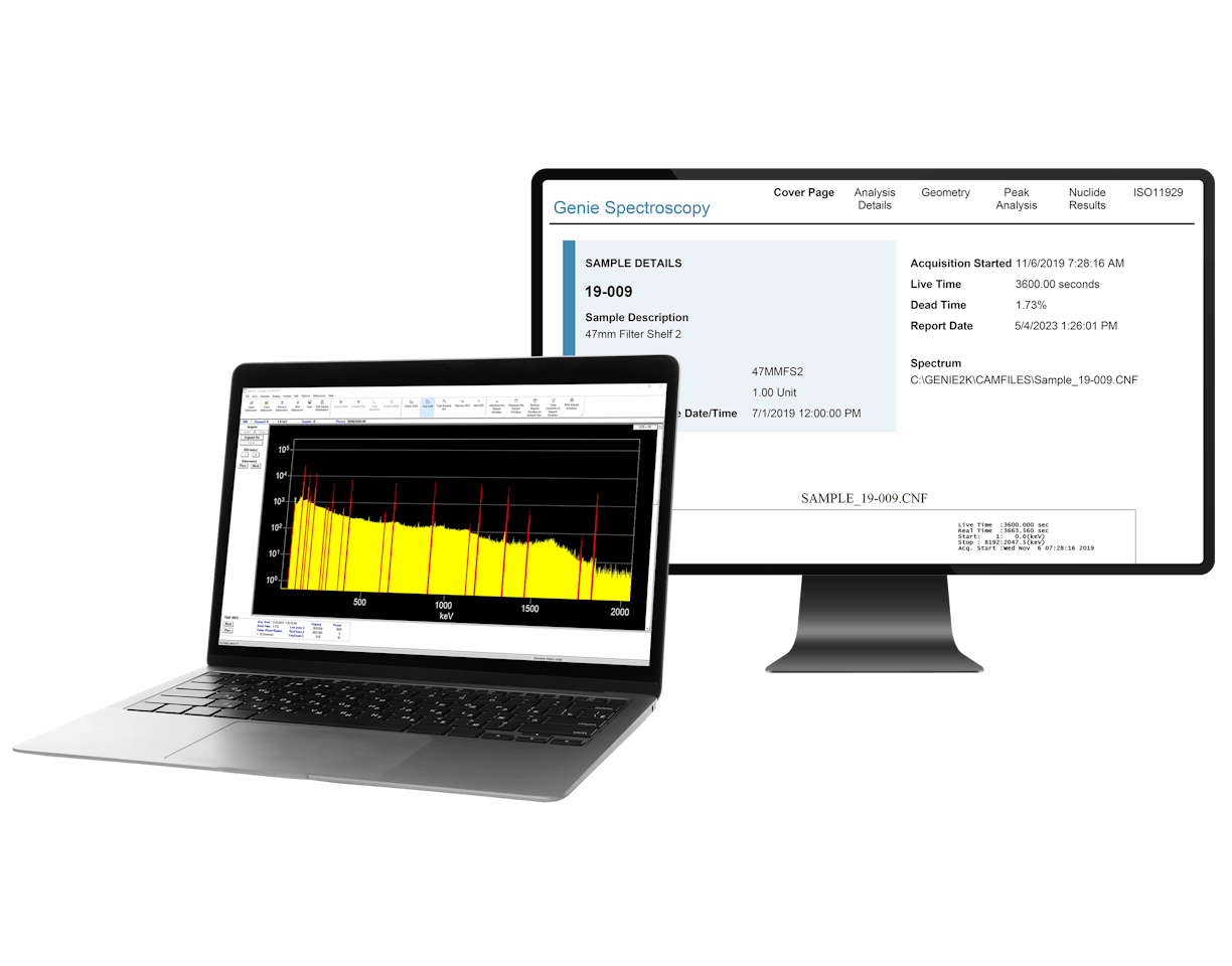
Genie™

S573 ISOCS™

Lynx® II

Intelligent Cryo-Cycle™

Germanium
Product & Industry Announcements
This is the module used on the homepage for the featured articles - but any type of entry can be used in this section.
Fields:
- Heading
- Main Featured Article Selector*: Max 3
- Tag
- Secondary Heading
- Secondary Featured Article Selector*: Max 6
- Tag
- Section ID
Main Featured Articles Heading


Secondary Featured Articles Heading
-

-
 News | September 16, 2025
Mirion Partners with IAEA to Enhance Radiation Safety on a Global Scale
-
 News | September 11, 2025
Mirion to Join the U.S. Industry Program at the 69th IAEA General Conference in Vienna, Austria
-
 Story | September 11, 2025
Mirion Japan Supports Opening of Advanced Radiation Emergency Medical Center at Fukui University
-
 News | September 5, 2025
Mirion Brings Global Nuclear Safety Expertise to NECX 2025
-
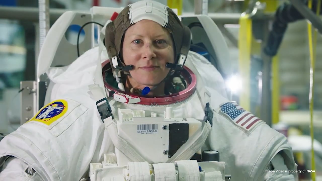
 Story | August 22, 2025
Mirion Crew Active Dosimeters to Be Worn by Astronauts on NASA’s Artemis II Mission
Resources & Events
Note: There is a max of 4 entries in each section
Fields:
- Webinar Selector
- Upcoming Events Selector
- Popular Training Courses Selector
- Section ID
Resources & Events
Webinars
-
From Complex Spectra to Confident Decisions: Isotopic Analysis with FRAM Multi
-
From Infrastructure to Instrumentation: How Paragon Supports New Nuclear
-
Licensing the Next Generation of Nuclear: Certrec’s End-to-end Solutions
-
Seeing Clearly in High Radiation: Proven Radiation‑Tolerant Cameras
Popular Training Courses
HPGe Setup and Troubleshooting
Python Scripting with Genie Software Training
iCAM Operations and Maintenance
How to Apply Cascade Corrections in Mirion Software
Split Homepage Mantle
Split Homepage Mantle Module Fields:
- Background Slide Selector
- Section ID
Split Homepage Mantle Fields:
- Heading*
- CTA
- Slide Image

Improving quality of cancer care from diagnosis through treatment
